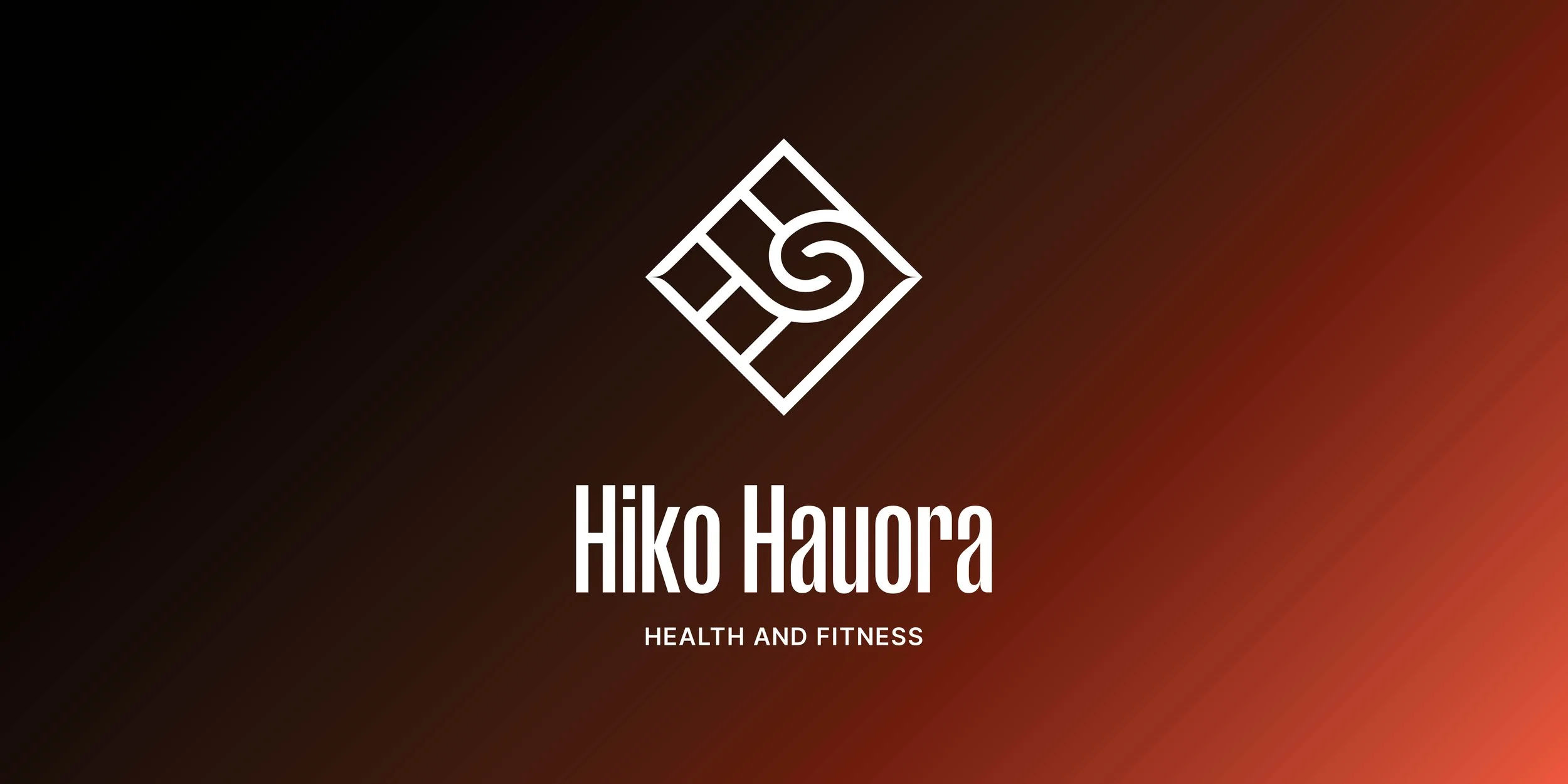
Hiko Hauora Rebrand
For over 12 years, Hiko Hauora has built a close-knit community, supporting clients through fitness, bodywork, and nutrition services. Following changes within the business, a rebrand was needed to mark a new chapter while honouring the strong relationships already in place.
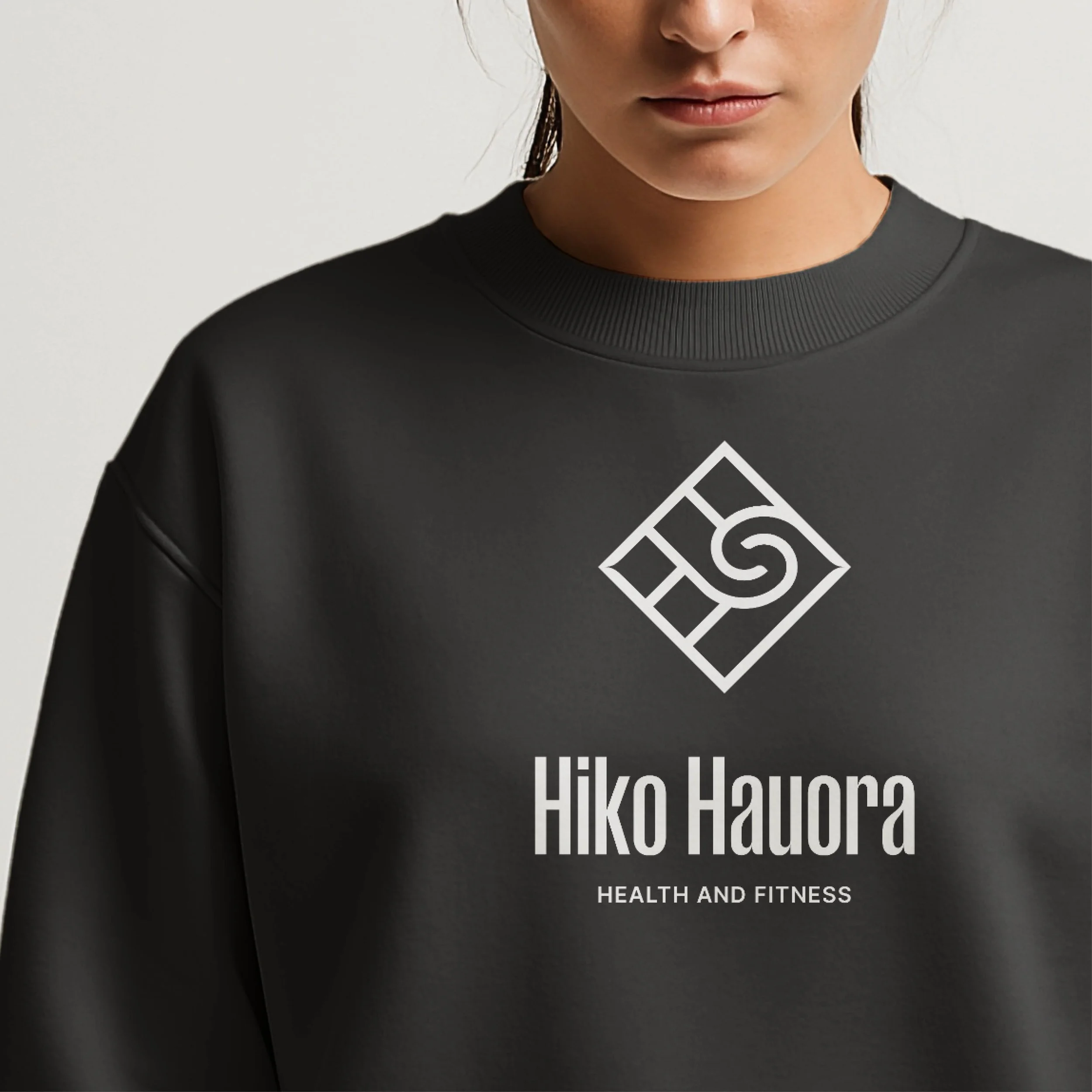
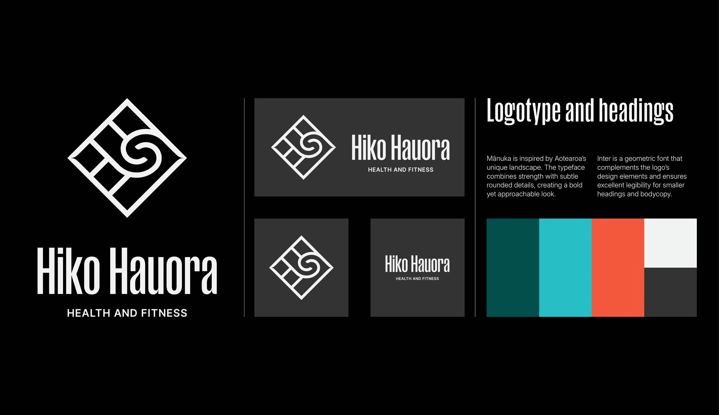
Building on the existing logo — which holds deep meaning for both the founder and clients — the refreshed identity distils the mark to its core components in a more functional and versatile form. The updated logo is easier to apply across platforms while maintaining a strong connection to its origins.
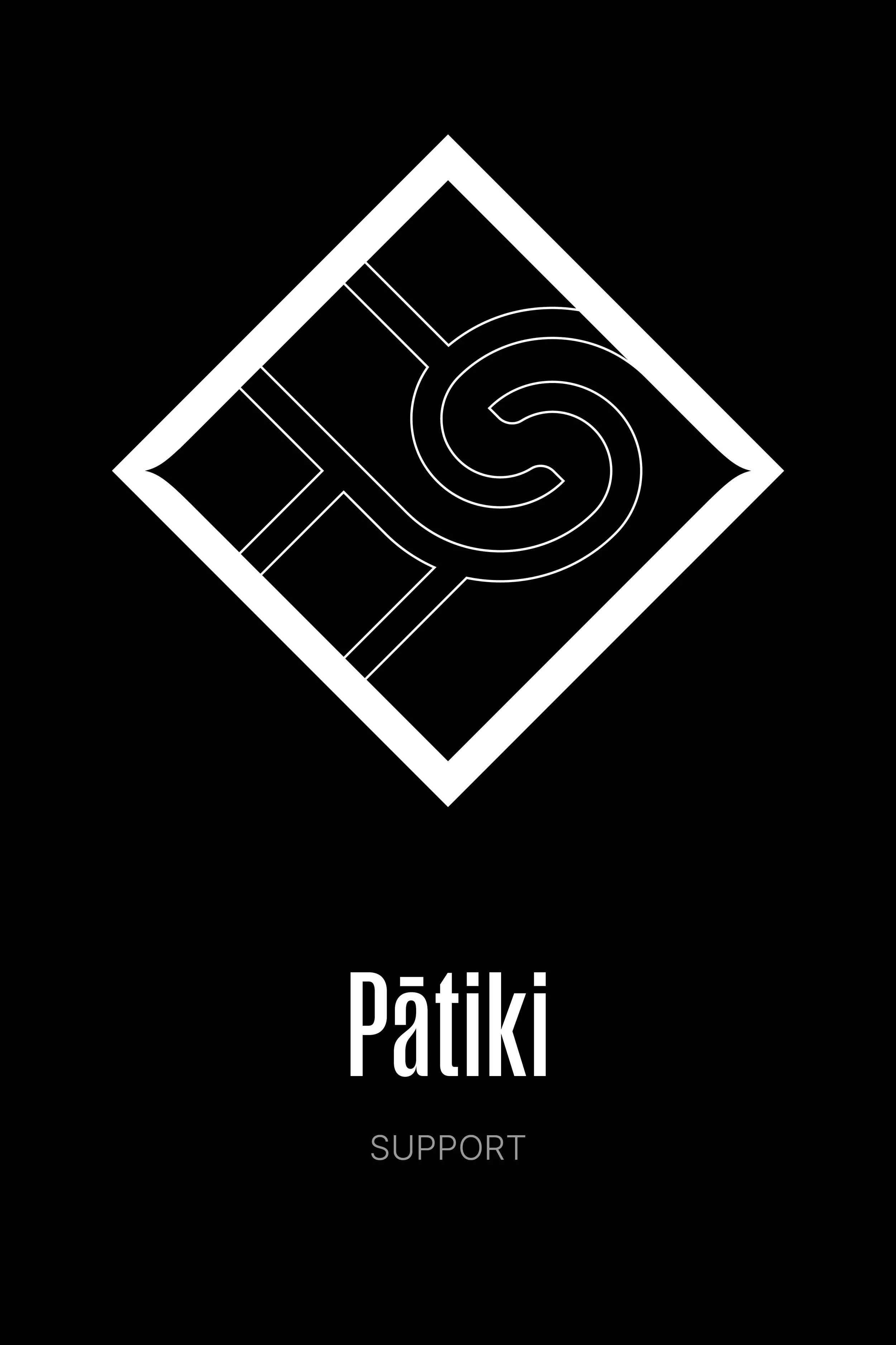
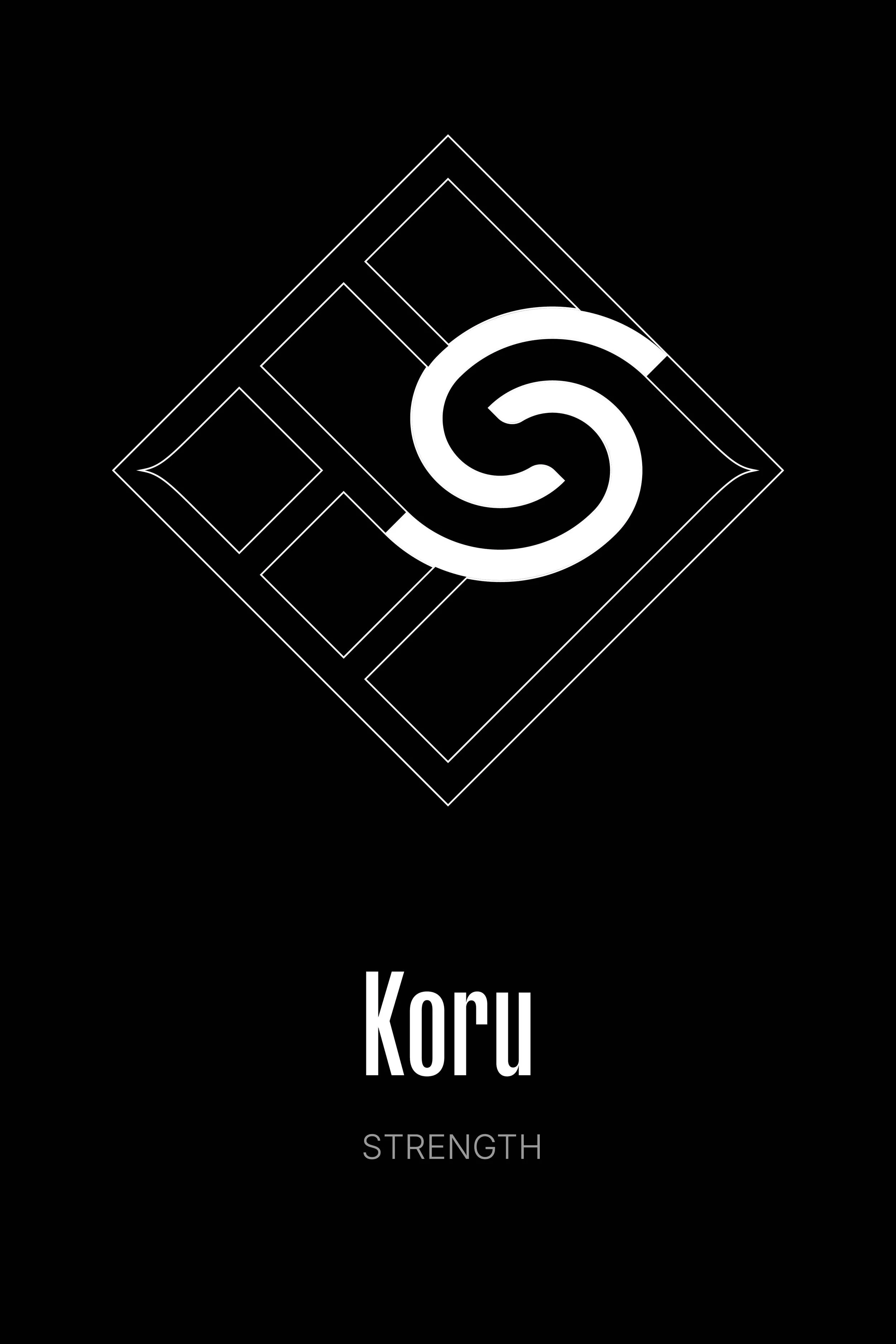
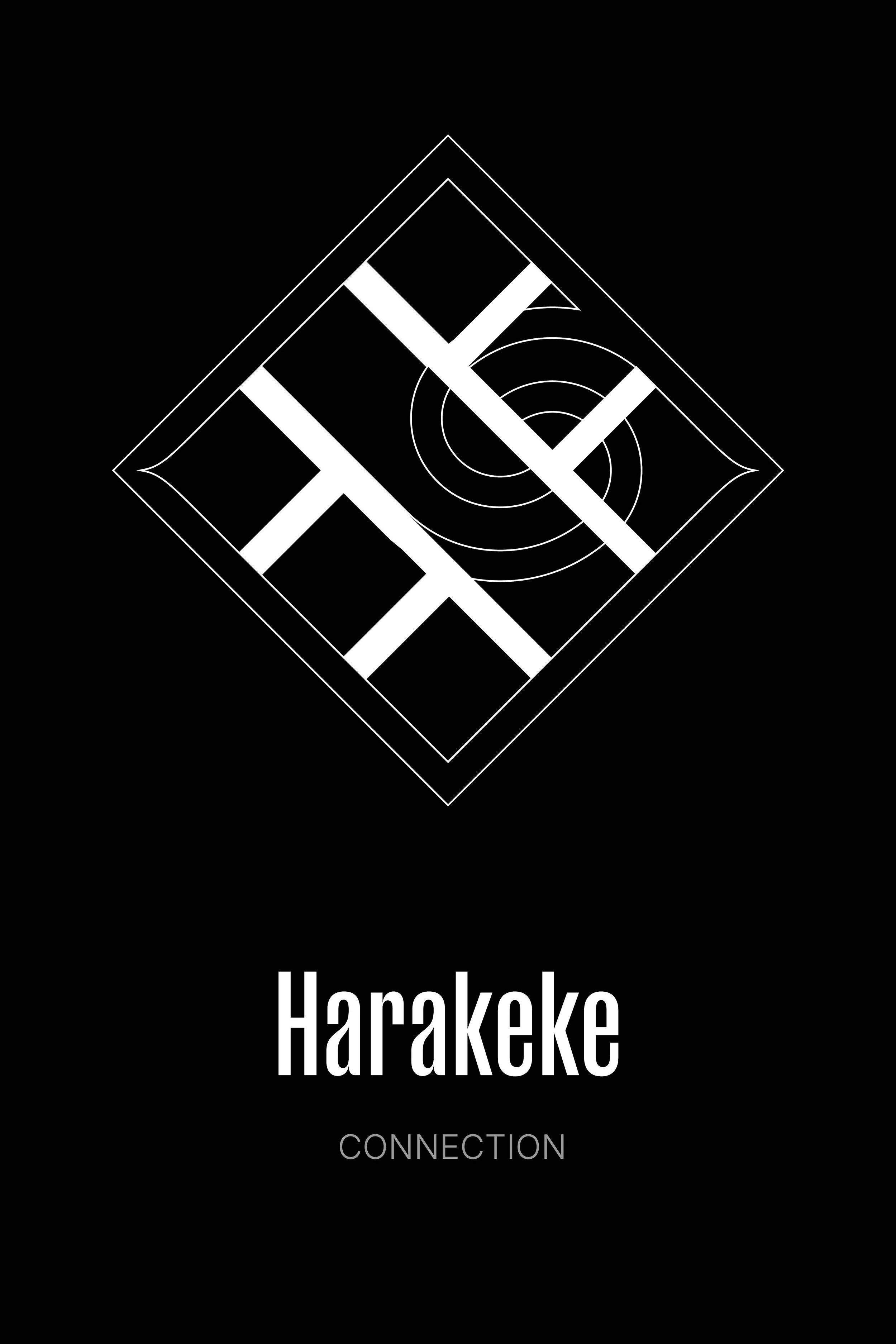
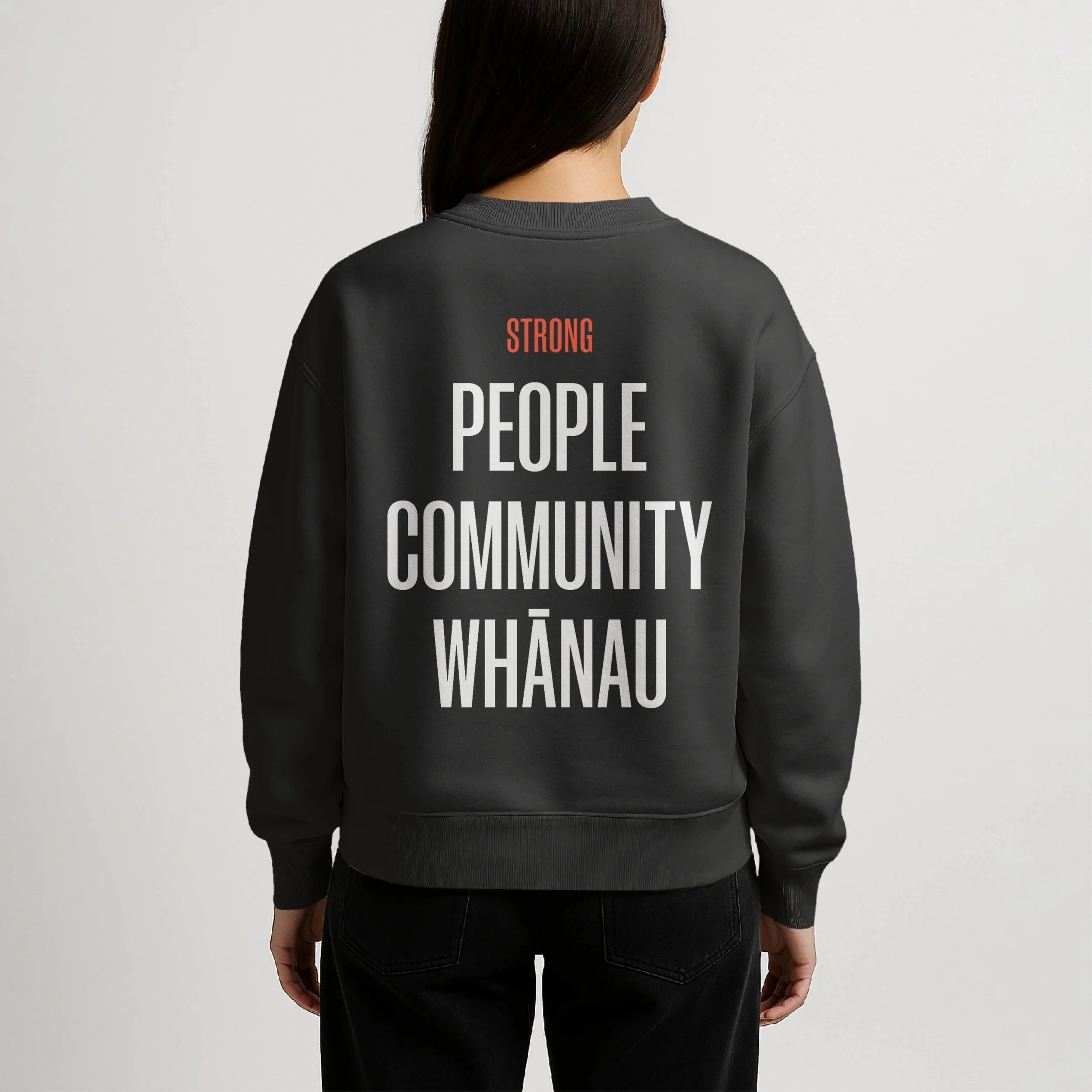
The new brand identity provides a sense of continuity and reassurance, helping existing and new clients feel supported and confident in their health and wellbeing journey with Hiko Hauora. The brand reflects support, strength, and connection — a place for the services, and the community around them, to live.
Expertise
Brand identity
Logo design
Colour palette development
Typography selection
If you’d like to work with me on a design or illustration project, discuss a contract role, or commission a custom handmade piece, I’d love to hear from you.