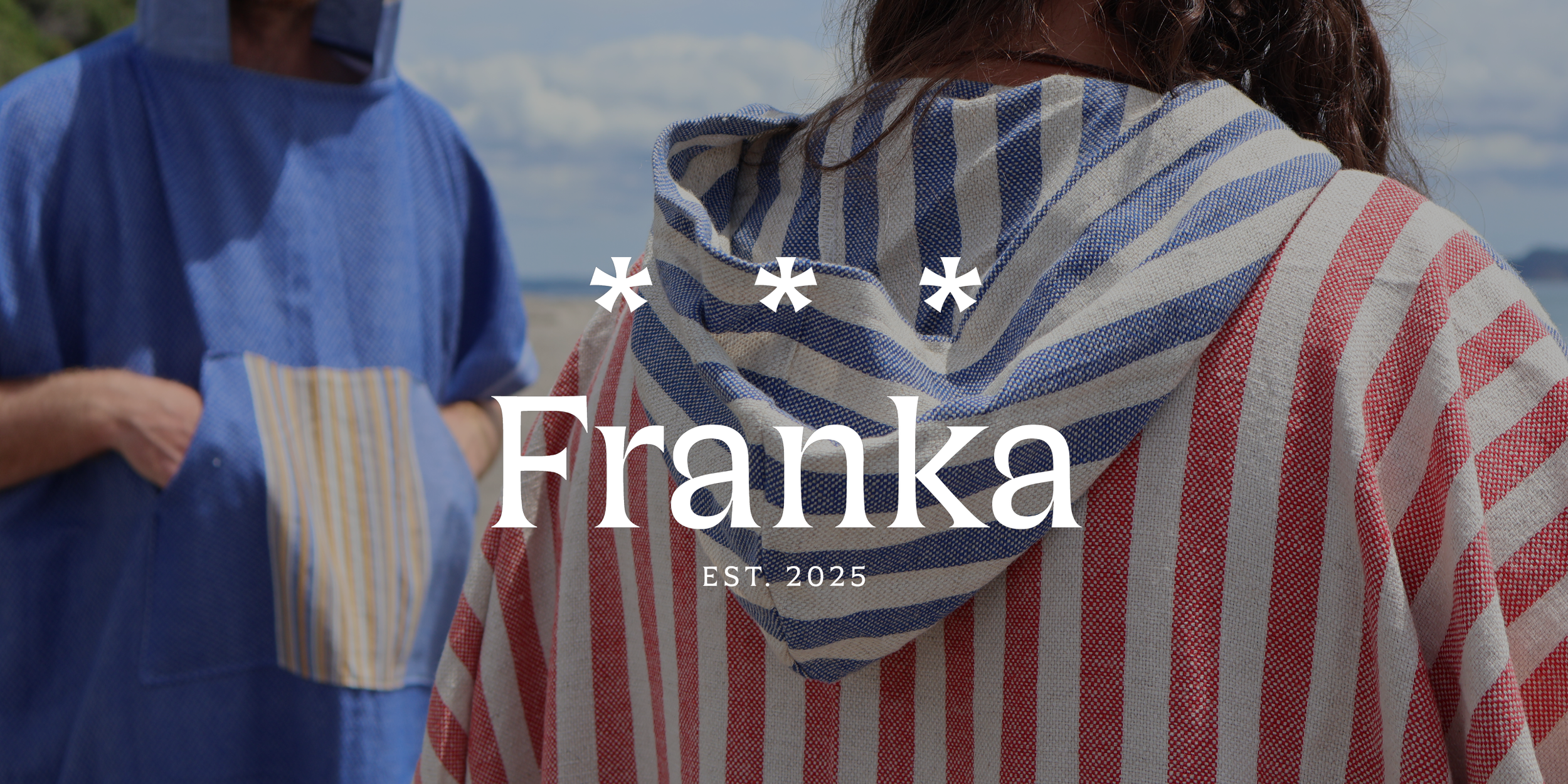
Franka Brand Identity
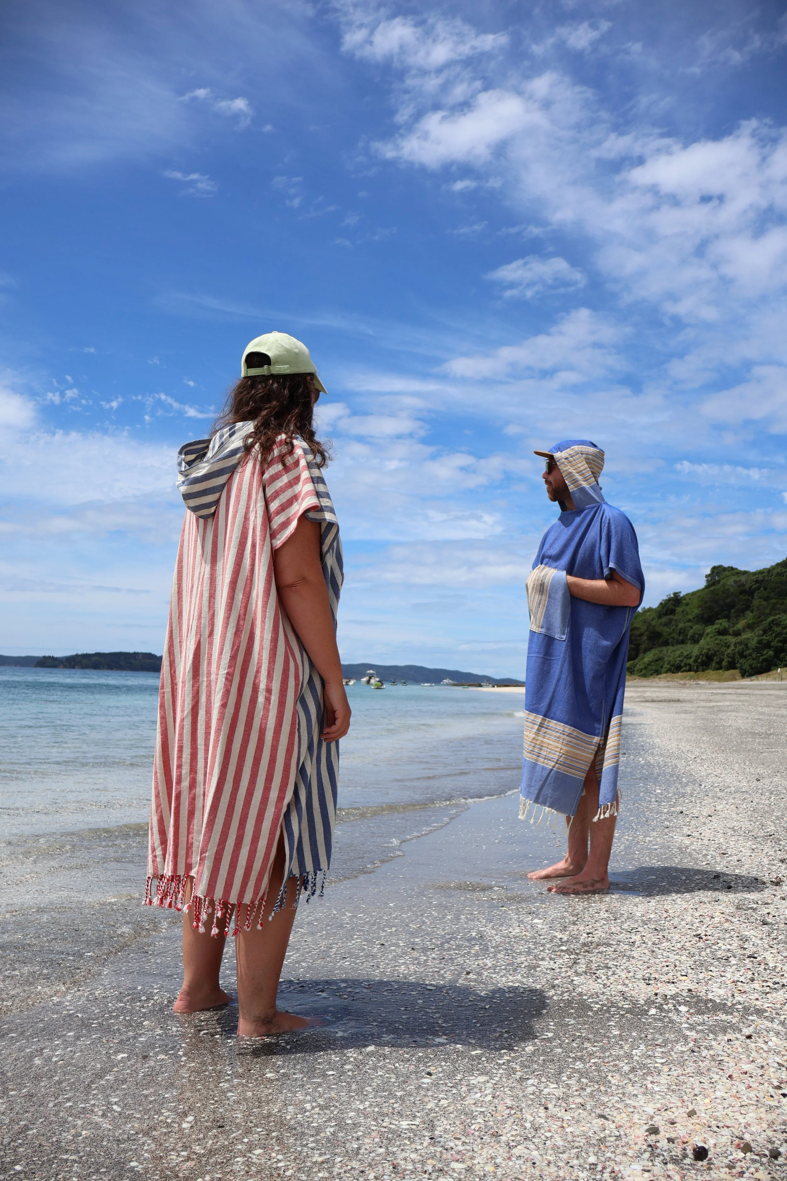
Franka is my personal brand and an ongoing design project that reflects how I like to work: hands-on, thoughtful, and always evolving. The logo mark needed to feel refined, but flexible enough to be applied to different mediums — from sewn garments to paintings to physical objects — without feeling locked into one way of making.
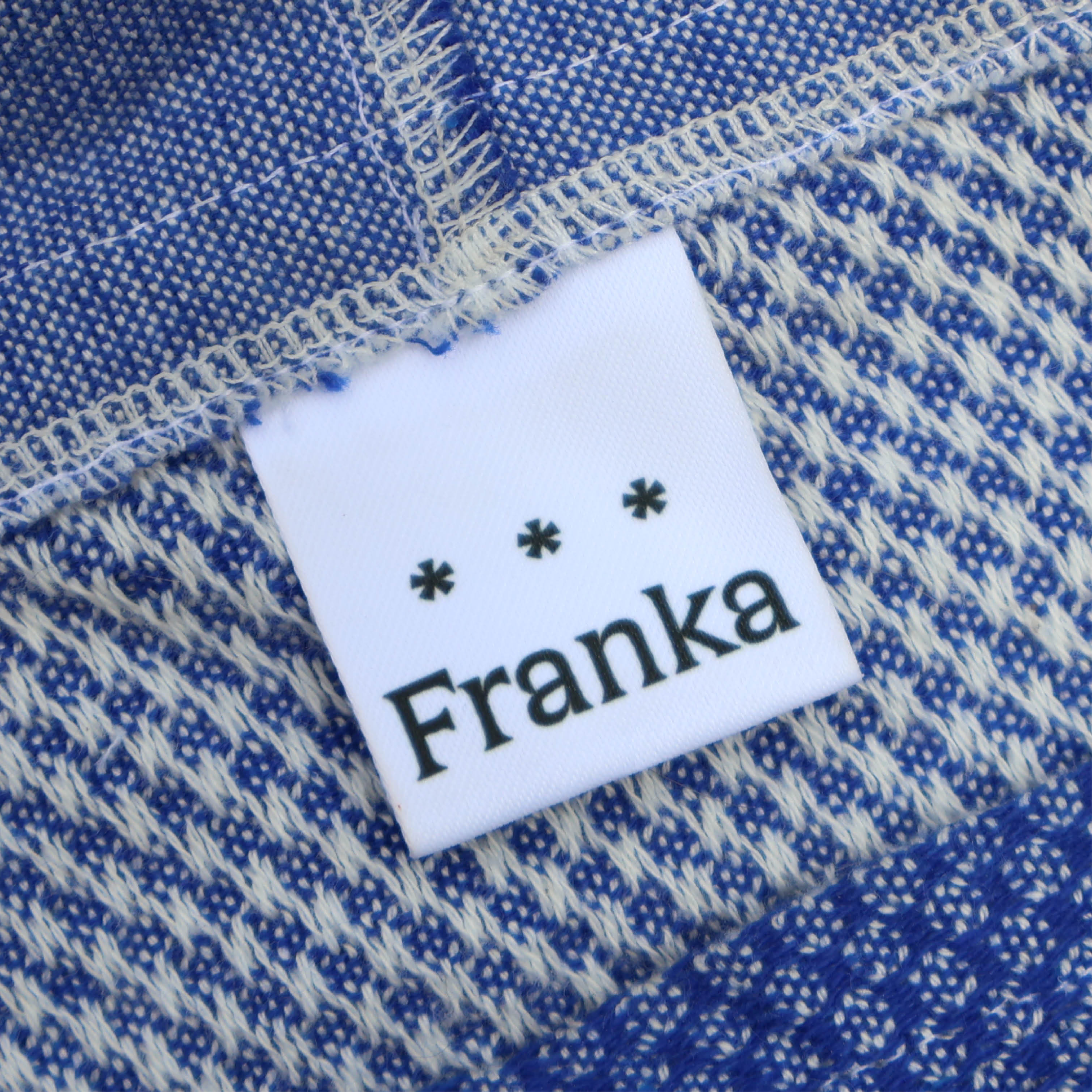
The Franka wordmark is drawn from my name, giving the brand personality and a sense of authorship. Alongside it sits the dinkus ( * * * ). It’s one of lesser-known typographical ornaments with the best name of any glyph under the sun. In books, a dinkus marks a shift in context or scene while remaining part of the same story. For Franka, it works in much the same way: a visual cue for changing mediums over time, while everything remains part of the same creative story — mine.
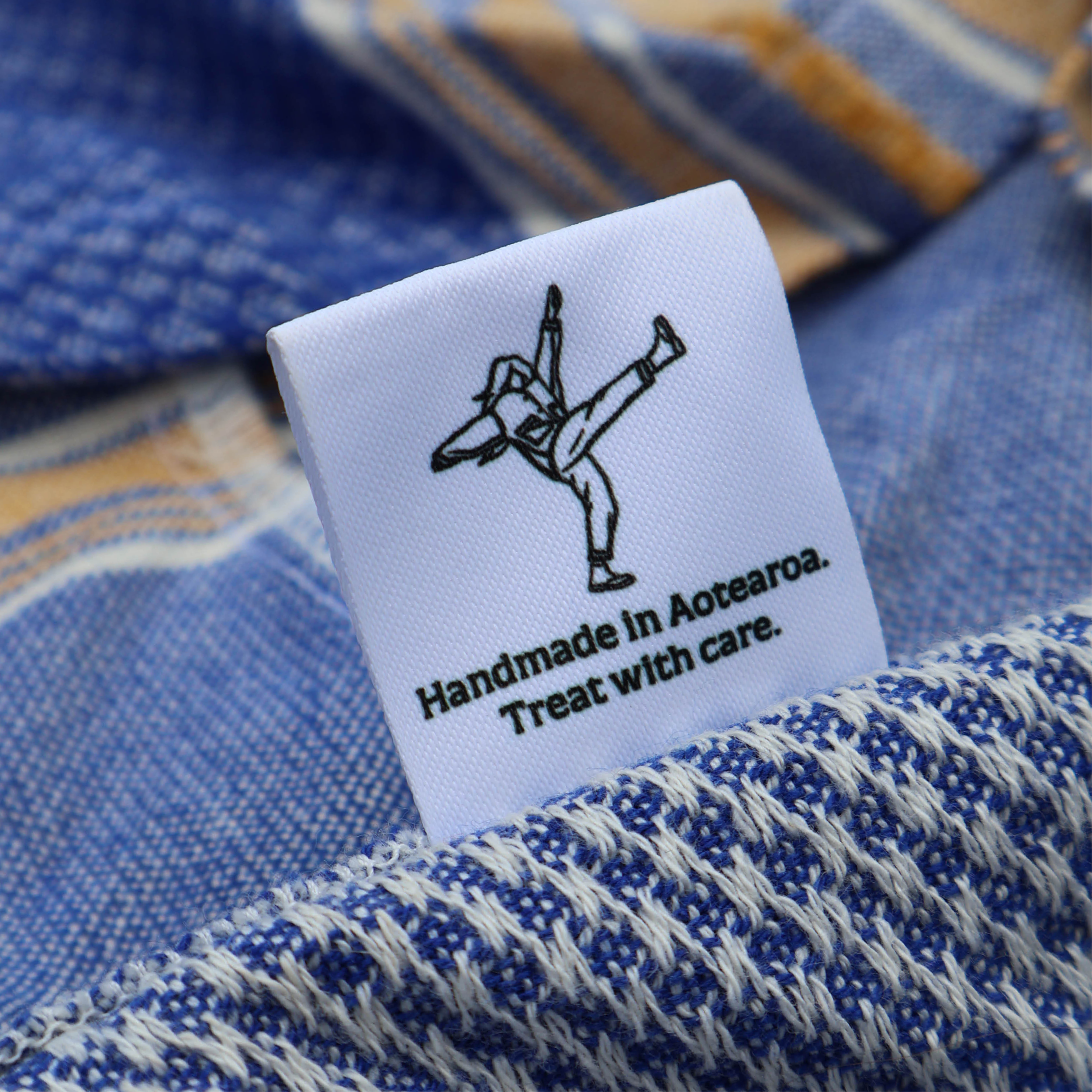
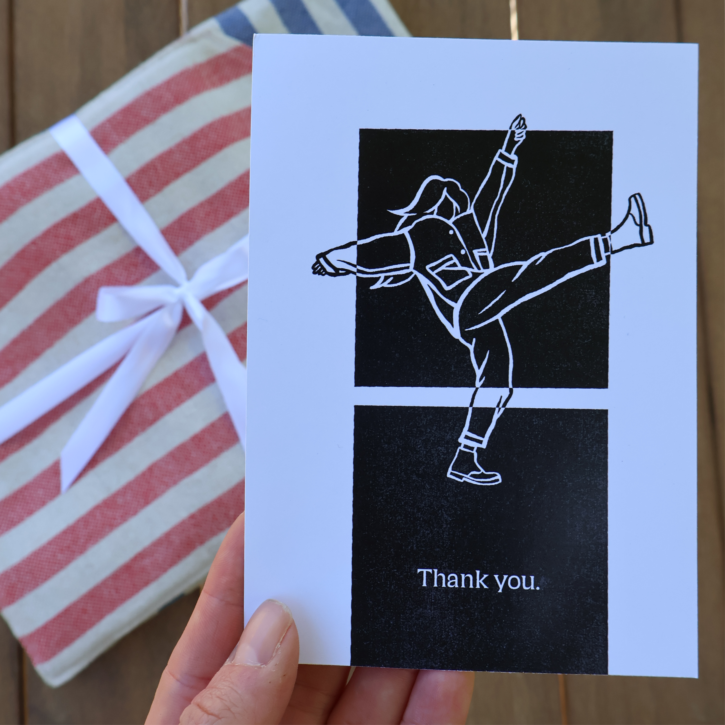
A hand-drawn sketch of myself is used as a kind of visual signature, reinforcing that each piece is made entirely by one person. It adds a human layer to the identity and gives me flexibility in how the brand shows up across different contexts.
The typeface, Silverspoon, was chosen for its soft curves, which reminded me of the lines found in pattern construction and garment making. Together, these elements form a design language that feels tactile, intentional, and adaptable — supporting Franka as both a brand and an ongoing making practice.
Expertise
Brand identity
Logo design
Illustration
Animation
Typography
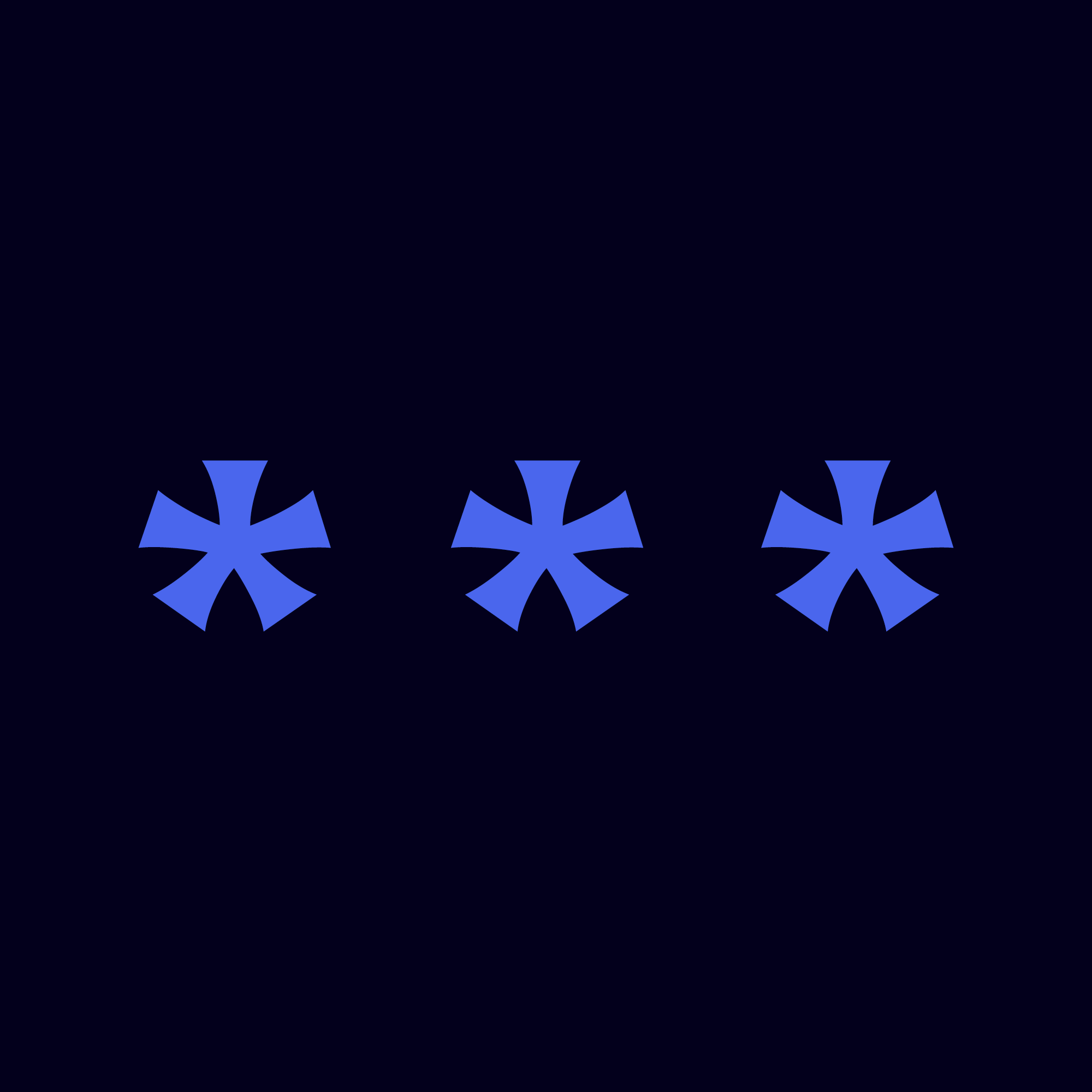
Above: The dinkus – one of the lesser-known typographical ornaments with the best name of any glyph.
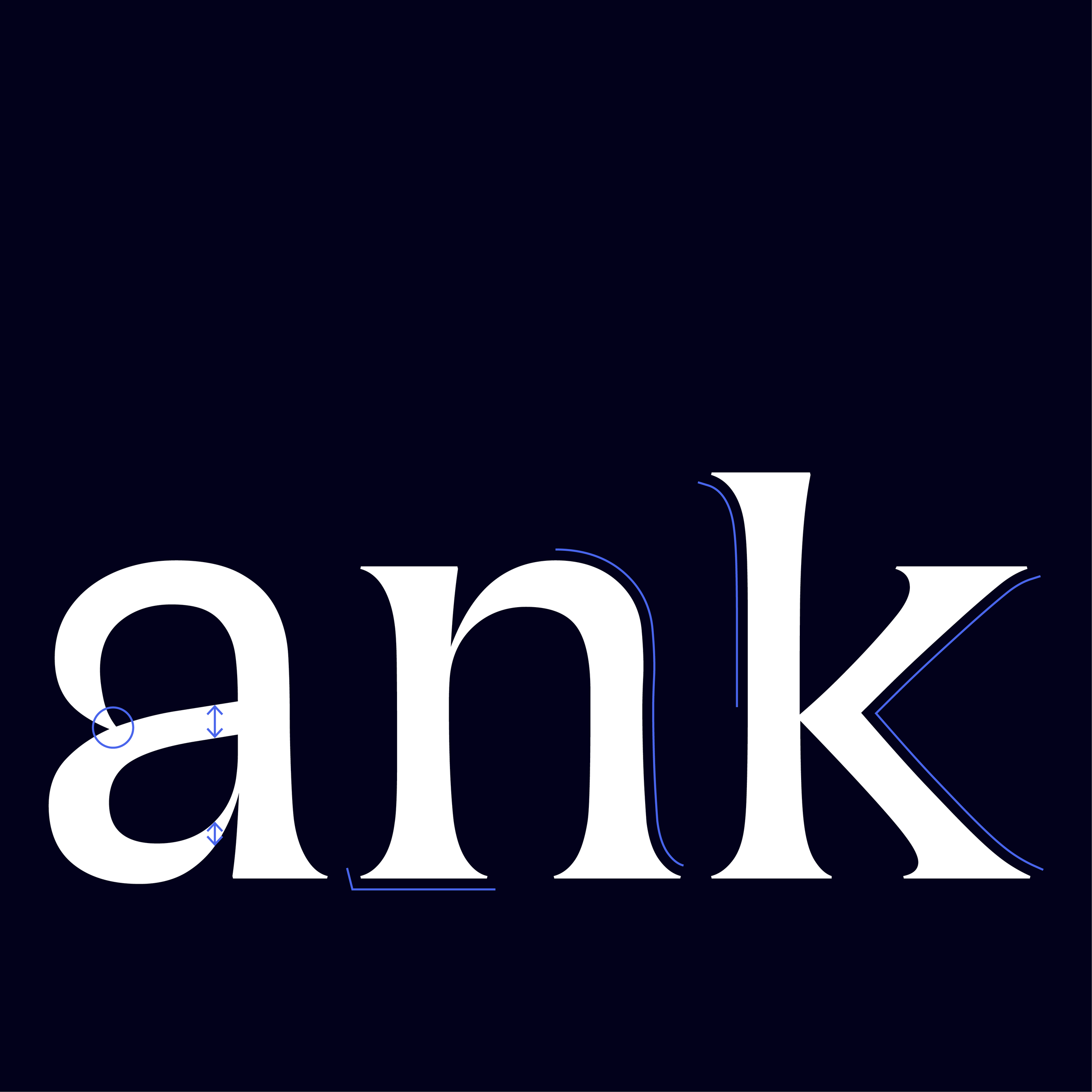
Left: Typographic details, reminiscent of pattern making and craft.
If you’d like to work with me on a design or illustration project, discuss a contract role, or commission a custom handmade piece, I’d love to hear from you.